Dua Lipa's website consists of her logo in the top left corner with a black and white theme. The menu bar is clear and simplistic and it has her social media and streaming platforms in the top right. The first thing we see is a promotion for her new song 'Swan Song' with a large picture of a shot from the music video which you can click on to follow to the actual music video. Her website is successful in promoting her as an artist and her style, providing a modern and interesting website for a broad audience.
Ariana's website is similar to Dua Lipa's following the conventions of a standard pop artist. It has her logo inverted upside down in the top left corner and her social media platforms in the top right. However, it has no menu bar and runs in one page. It promotes her most recent single and music video, showing pictures of her childhood which would appeal to her fans. It follows the colour theme of black, white and pink which are recognisable to her brand.
Little Mix's website also fits the expected conventions of a pop artist's website. It shows the band members in a background picture which represents the band and their style. Their logo is also in the top left corner. However their menu bar is central which adds a nice modern twist fitting to the chic aspects of their website and music style. It is simplistic in it's colours which makes the picture stand out but also attractive to a modern audience.
Billie Eilish's website is very different to conventional websites which represents her unique style. It is an interactive experience in which the viewer can look around a room with her kind of gothic, emo style around the room. On the mirror are the clickable links to her other pages. This is a unique and innovative website style which is very attractive to modern audiences and particularly her audience type.
Bastille's website also doesn't fit conventions. It has no photography of the artist on it and instead has artwork as the background. It is promoting their newest release by presenting the song title in a large font, unique to the artist, in the top centre. The 'A' of 'Doom Days' reflects Bastille's logo, creating a strong and recognisable brand identity. The social media links are in the top right corner, and the site navigational links are bellow the single title which is modern and attractive to Bastille's alternative audience type.
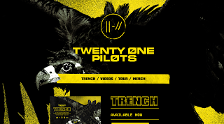
The Twenty One Pilots website consists of the recognisable black and yellow colour palette that the artist have used in their recent album promotion, creating a strong brand identity. The background is the same picture that is used for the artist's most recent album release; a crow from the album cover of 'trench'. It has the band's newly vamped logo in the top centre, creating brand identity but also showing their new movement into their new music. It reflects their alternative-rock music style with the darker imagery and squared font on the website. It promotes their new release well and is very appealing to their audience type, even though it shows no pictures of the artist.

Panic! At the Disco's website has their latest recognisable logo in the top left and menu bar on the top right, fitting usual conventions. It has their most recent album 'Pray for the Wicked' cover art as the background, promoting their new album release. The art features graphics of the lead singer Brendon Urie who is the most recognisable member of the band, creating strong brand identity. All teh text is white and simplistic to compliment the colours of the cover art and make that feature strongest. It is appealing to the new audience that they are trying to captivate; a more mainstream front away from their traditional emo-rock style.

Fall Out Boy's website is very dark and simplistic, reflecting their emo-rock style. It is aimed at their audience specifically not a mainstream pop audience. It features their logo in the centre creating strong brand identity and only consists of the colours black and white to reinforce their emo-rock style, staying true to their roots and fanbase that has existed for near ten years.
Selena Gomez's website also fits the classic conventions of a mainstream artist website, reflecting her music style. It features a background picture of her in the most recent music video that she has released, promoting it to her audience. The colours of her page are simplistic and modern using a black and white colour palette. Her social media and streaming links are in the top left however, with her name logo centre among her menu bar options. It is effective in it's simplistic and modern purpose for attracting her mainstream audience type.
Taylor Swift's website is also that of a conventional mainstream artist. It features her name logo in the top centre and her social media links in the top right with her menu bar left. It also has photography promoting her most recent single 'me' using the colour palette of the single art with pink, blue and other pastel colours. It is modern and simplistic and successfully attracts mainstream audiences.


Comments
Post a Comment